Creating Lists and Cards
To create complex lists and cards with material design styles in your apps, you can use the RecyclerView and CardView widgets.
material designを適用したリストやカードUIを作成するために, RecyclerViewやCardViewを使用できます.
Create Lists
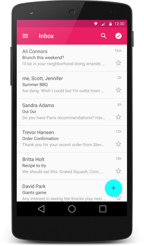
Figure 2 - Lists with RecyclerView.
The RecyclerView widget is a more advanced and flexible version of ListView. This widget is a container for displaying large data sets that can be scrolled very efficiently by maintaining a limited number of views. Use the RecyclerView widget when you have data collections whose elements change at runtime based on user action or network events.
RecyclerView widgetは, より最新で柔軟性のあるListViewのバージョンです. このwidgetは限られたviewをリサイクルして使い回すことで, 非常に効率的にスクロールできる大きなデータセットを表示するためのコンテナです. ユーザのアクションやネットワクークのイベントに基づいて, 実行時に要素が変わるデータの集まりを持つ場合は, RecyclerView widgetを使用してください.
The RecyclerView class simplifies the display and handling of large data sets by providing:
- Layout managers for positioning items
- Default animations for common item operations, such as removal or addition of items
You also have the flexibility to define custom layout managers and animations for RecyclerView widgets.
RecyclerViewのクラスは以下の機能が提供され, 表示や大きなデータセットの扱いを容易にします.
- アイテムを位置付けるレイアウトマネージャー
- アイテムの削除や追加のような一般的な操作のためのデフォルトアニメーション
また, RecyclerView widget用のカスタムレイアウトマネージャーやアニメーションを定義するための柔軟性を兼ね備えています.
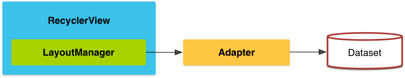
Figure 1. The RecyclerView widget.
To use the RecyclerView widget, you have to specify an adapter and a layout manager. To create an adapter, extend the RecyclerView.Adapter class. The details of the implementation depend on the specifics of your dataset and the type of views. For more information, see the examples below.
RecyclerView widgetを使用するには, adapterと layout managerを指定する必要があります. adapterを生成するには, RecyclerView.Adapterクラスを継承します. 実装の詳細は, データセットやviewの種類によって異なります. 詳細は本ページ下部のExamplesを参照.
A layout manager positions item views inside a RecyclerView and determines when to reuse item views that are no longer visible to the user. To reuse (or recycle) a view, a layout manager may ask the adapter to replace the contents of the view with a different element from the dataset. Recycling views in this manner improves performance by avoiding the creation of unnecessary views or performing expensive findViewById() lookups.
layout managerは, RecyclerView内のアイテムを位置付けし, ユーザからは見えなくなったviewを再利用するタイミングを決定します. viewをリサイクルするために, レイアウトマネージャーはadapterに異なるデータでview要素の入れ替えを求めることがあります. このようにviewのリサイクルすることで, 不要なviewの生成やコストのかかるfindViewById()のルックアップ処理を防ぐことでパフォーマンスを改善します.
RecyclerView provides these built-in layout managers:
- LinearLayoutManager shows items in a vertical or horizontal scrolling list.
- GridLayoutManager shows items in a grid.
- StaggeredGridLayoutManager shows items in a staggered grid.
To create a custom layout manager, extend the RecyclerView.LayoutManager class.
RecyclerViewはビルトインされた次のレイアウトマネージャーを提供します.
- LinearLayoutManager アイテムを縦または横のスクロールリスト内に表示します.
- GridLayoutManager アイテムをグリッド表示します.
- StaggeredGridLayoutManager アイテムをスタッカードグリッド状に表示します.
カスタムレイアウトマネージャーを作成するには, RecyclerView.LayoutManagerクラスを継承します.
Animations
Animations for adding and removing items are enabled by default in RecyclerView. To customize these animations, extend the RecyclerView.ItemAnimator class and use the RecyclerView.setItemAnimator() method.
RecyclerViewでは, アイテムの追加や削除のアニメーションがデフォルトで有効になっています. これらのアニメーションをカスタマイズするには, RecyclerView.ItemAnimatorクラスを継承し, RecyclerView.setItemAnimator()メソッドを使用します.
Examples
The following code example demonstrates how to add the RecyclerView to a layout:
以下のコードは, レイアウトにRecyclerViewを追加する方法の一例です.
<!-- A RecyclerView with some commonly used attributes -->
<android.support.v7.widget.RecyclerView
    android:id="@+id/my_recycler_view"
    android:scrollbars="vertical"
    android:layout_width="match_parent"
    android:layout_height="match_parent"/>
Once you have added a RecyclerView widget to your layout, obtain a handle to the object, connect it to a layout manager, and attach an adapter for the data to be displayed:
レイアウトにRecyclerView widgetを追加したら, それを取得してlayout managerを登録し, データを表示するためのadapterをアタッチします.
public class MyActivity extends Activity {
    private RecyclerView mRecyclerView;
    private RecyclerView.Adapter mAdapter;
    private RecyclerView.LayoutManager mLayoutManager;

    @Override
    protected void onCreate(Bundle savedInstanceState) {
        super.onCreate(savedInstanceState);
        setContentView(R.layout.my_activity);
        mRecyclerView = (RecyclerView) findViewById(R.id.my_recycler_view);

        // use this setting to improve performance if you know that changes
        // in content do not change the layout size of the RecyclerView
        mRecyclerView.setHasFixedSize(true);

        // use a linear layout manager
        mLayoutManager = new LinearLayoutManager(this);
        mRecyclerView.setLayoutManager(mLayoutManager);

        // specify an adapter (see also next example)
        mAdapter = new MyAdapter(myDataset);
        mRecyclerView.setAdapter(mAdapter);
    }
    ...
}
The adapter provides access to the items in your data set, creates views for items, and replaces the content of some of the views with new data items when the original item is no longer visible. The following code example shows a simple implementation for a data set that consists of an array of strings displayed using TextView widgets:
adapterはデータセット内の各項目へのアクセスやviewの生成, 元のアイテムが見えなくなった時に新たなデータ項目でviewの内容を入れ替える仕組みを提供します. 以下のコードは, TextView widgetsを使用して表示したString配列から構成されたデータセットを実装する簡単な例です.
public class MyAdapter extends RecyclerView.Adapter<MyAdapter.ViewHolder> {
    private String[] mDataset;

    // Provide a reference to the views for each data item
    // Complex data items may need more than one view per item, and
    // you provide access to all the views for a data item in a view holder
    public static class ViewHolder extends RecyclerView.ViewHolder {
        // each data item is just a string in this case
        public TextView mTextView;
        public ViewHolder(TextView v) {
            super(v);
            mTextView = v;
        }
    }

    // Provide a suitable constructor (depends on the kind of dataset)
    public MyAdapter(String[] myDataset) {
        mDataset = myDataset;
    }

    // Create new views (invoked by the layout manager)
    @Override
    public MyAdapter.ViewHolder onCreateViewHolder(ViewGroup parent,
                                                   int viewType) {
        // create a new view
        View v = LayoutInflater.from(parent.getContext())
                               .inflate(R.layout.my_text_view, parent, false);
        // set the view's size, margins, paddings and layout parameters
        ...
        ViewHolder vh = new ViewHolder(v);
        return vh;
    }

    // Replace the contents of a view (invoked by the layout manager)
    @Override
    public void onBindViewHolder(ViewHolder holder, int position) {
        // - get element from your dataset at this position
        // - replace the contents of the view with that element
        holder.mTextView.setText(mDataset[position]);

    }

    // Return the size of your dataset (invoked by the layout manager)
    @Override
    public int getItemCount() {
        return mDataset.length;
    }
}
Create Cards

Figure 3. Card examples.
CardView extends the FrameLayout class and lets you show information inside cards that have a consistent look across the platform. CardView widgets can have shadows and rounded corners.
CardViewはFrameLayoutクラスを継承し, あらゆるプラットホームで一貫した外観を持つカード内の情報を表示することができます.
To create a card with a shadow, use the card_view:cardElevation attribute. CardView uses real elevation and dynamic shadows on Android 5.0 (API level 21) and above and falls back to a programmatic shadow implementation on earlier versions. For more information, see Maintaining Compatibility.
影があるカードを作成するには, card_view:cardElevation属性を使用します. CardViewは, Android 5.0 (API level 21)以上ではリアルなエレベーションとダイナミックな影を使い, それ以前のバージョンではプログラム的な影の実装に代替されます. 詳細は, Maintaining Compatibilityを参照.
Use these properties to customize the appearance of the CardView widget:
- To set the corner radius in your layouts, use the card_view:cardCornerRadius attribute.
- To set the corner radius in your code, use the CardView.setRadius method.
- To set the background color of a card, use the card_view:cardBackgroundColor attribute.
これらのプロパティを使用してCardView widgetの外観をカスタマイズします.
- レイアウトの角の丸みを設定するには,
card_view:cardCornerRadius属性を使用します. - コード上で角の丸みを設定するには,
CardView.setRadiusメソッドを使用します. - カードの背景色を設定するには,
card_view:cardBackgroundColor属性を使用します.
The following code example shows you how to include a CardView widget in your layout:
以下のコード例は, レイアウトにCardView widgetを含む方法です.
<LinearLayout xmlns:android="http://schemas.android.com/apk/res/android"
    xmlns:tools="http://schemas.android.com/tools"
    xmlns:card_view="http://schemas.android.com/apk/res-auto"
    ... >
    <!-- A CardView that contains a TextView -->
    <android.support.v7.widget.CardView
        xmlns:card_view="http://schemas.android.com/apk/res-auto"
        android:id="@+id/card_view"
        android:layout_gravity="center"
        android:layout_width="200dp"
        android:layout_height="200dp"
        card_view:cardCornerRadius="4dp">

        <TextView
            android:id="@+id/info_text"
            android:layout_width="match_parent"
            android:layout_height="match_parent" />
    </android.support.v7.widget.CardView>
</LinearLayout>
For more information, see the API reference for CardView.
詳細は, CardViewのAPIリファレンスを参照.
Add Dependencies
The RecyclerView and CardView widgets are part of the v7 Support Libraries. To use these widgets in your project, add these Gradle dependencies to your app’s module:
RecyclerViewとCardViewのwidgetsはv7サポートライブラリの一部です. これらのwidgetを使用するには, 以下のGradleの依存関係をアプリのモジュールに追加します.
dependencies {
    ...
    compile 'com.android.support:cardview-v7:21.0.+'
    compile 'com.android.support:recyclerview-v7:21.0.+'
}
LICENSE
Portions of this page are modifications based on work created and shared by the Android Open Source Project and used according to terms described in the Creative Commons 2.5 Attribution License.
Original source: http://developer.android.com/training/material/lists-cards.html