2014/11/26

Android: SQLiteOpenHelperコンストラクタの引数CursorFactoryについて

Overview

SQLiteOpenHelperのコンストラクタを見てみると第三引数にCursorFactoryを受け取るようになっている.

SQLiteOpenHelper (Context, String, CursorFactory, int)

SQLiteデータベースを使用したサンプルコードではnullが指定されるケースが多く, あまり活用事例を見ない.

db = new MyDatabase(context, DB_NAME, null /*CursorFactory*/, DB_VERSION);

本稿ではCursorFactoryの利用する方法について記載する.

SQLiteDatabaseにクエリを発行するとCursorが返却される.
Android標準では, このCursor生成処理を拡張できるCursorFactoryクラスを用意している.
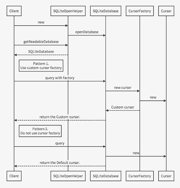
CursorFactoryを使ってCursorクラスを得るまでの一般的な流れは下記.

CursorFactoryを実装することで次のことが実現できる.

  • Cursor生成のタイミングをフックする
  • クエリ結果として独自Cursorを返す

ただし, 2点目の独自Cursorを返すについては注意事項がある(後述).

API Reference.

CursorFactoryと周辺のクラスを次に記す.

SQLiteOpenHelper - API Reference - Android Developers
SQLiteDatabaseの生成とバージョンを管理するクラス.

SQLiteDatabase - API Reference - Android Developers
SQLiteデータベースの生成・破棄・問合せといったSQLの実行や管理を行うクラス.

SQLiteDatabase.CursorFactory - API Reference - Android Developers
SQLiteDatabaseへのクエリ結果を格納したCursorのファクトリクラス. ここで生成されるCursorインスタンスがクエリの戻り値(Cursor)として使われる.

SQLiteCursor - API Reference - Android Developers
SQLiteへのクエリ結果を格納したCursorの具象クラス. 内部のSQLiteCursorを直接操作する場合は別途スレッドセーフを自前で担保する必要がある.

SQLiteQueryBuilder - API Reference - Android Developers
SQLiteDatabaseへのクエリ構築を手助けするビルダクラス.

Set CursorFactory

Android標準でCursorの生成はSQLiteDirectCursorDriver.queryで行われる.

public Cursor query(CursorFactory factory, String[] selectionArgs) {
    ...
        if (factory == null) {
            cursor = new SQLiteCursor(this, mEditTable, query);
        } else {
            cursor = factory.newCursor(mDatabase, this, mEditTable, query);
        }
    ...
}

CursorFactoryが指定されていればCursorFactory.newCursorメソッドを経由してCursorを生成する.
ここで独自のCursorFactoryが指定されていればCursorの生成をフックし, 独自Cursorを返すことができる.

implements

CursorFactoryはSQLiteDatabaseの取得時に指定する.
SQLiteDatabaseにCursorFactoryを設定するメソッドはいくつかある.

しかし, 一般的にSQLiteDatabaseのメソッドを直接操作することはせず, SQLiteOpenHelperやSQLiteQueryBuilderを経由する.
そのため, SQLiteOpenHelperやSQLiteQueryBuilderにもCursorFactoryを設定するためのAPIが用意されている.

public class MyDBHelper extends SQLiteOpenHelper{
    public MyDBHelper(Context context){
        super(context, DB_NAME, CURSOR_FACTORY, DB_VERSION);
    }
    ...
}
@Override
public Cursor query(Uri uri, String[] projection, String selection,
                    String[] selectionArgs, String sortOrder) {
    SQLiteQueryBuilder builder = new SQLiteQueryBuilder();
    builder.setCursorFactory(CURSOR_FACTORY);
    ...
}

なお, CursorFactoryが指定されない場合はCursorのサブクラスであるSQLiteCursorが生成される.

次に, 独自のCursorFactoryを用意する.
CursorFactoryにはカーソルを生成するnewCursorメソッドが用意されており, ここでCursorを生成する.

public class MyCursorFactory implements CursorFactory {
    @Override
    public Cursor newCursor(SQLiteDatabase db, SQLiteCursorDriver masterQuery,
            String editTable, SQLiteQuery query) {
        return new SQLiteCursor(masterQuery, editTable, query);
    }
}

独自CursorFactoryを設定するためにSQLiteOpenHelperのコンストラクタ引数にこれを指定する.
他にもクエリ発行時にCursorFactoryを指定することもできる(後述).

public class MyContentProvider extends ContentProvider {
    @Override
    public boolean onCreate() {
        db = new MySQLiteOpenHelper(context, DB_NAME, 
                new MyCursorFactory(), DB_VERSION);
        ...
    }
}

Query API with CursorFactory

SQLiteDatabaseにクエリを問い合わせるために次のメソッドが用意されている.

queryWithFactory/rawQueryWithFactoryメソッドはCursorFactoryを直接指定してクエリを実行する.
一方, query/rawQueryメソッドは引数cursorFactoryにnullを指定して最終的にrawQueryWithFactoryを呼ぶ.

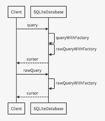
rawQueryWithFactoryメソッドは引数cursorFactoryにnullが指定されるとSQLiteDatabaseに設定されているCursorFactoryを使用する. この挙動にあたる部分のソースコードは下記.

// rawQuery系メソッドでは引数にnullを指定すると設定した独自CursorFactoryが使用される.
public Cursor rawQueryWithFactory(
        CursorFactory cursorFactory, String sql, String[] selectionArgs,
        String editTable, CancellationSignal cancellationSignal) {
    acquireReference();
    try {
        SQLiteCursorDriver driver = new SQLiteDirectCursorDriver(
                this, sql, editTable, cancellationSignal);
        return driver.query(
                cursorFactory != null ? cursorFactory : mCursorFactory,
                selectionArgs);
    } finally {
        releaseReference();
    }
}

MEMO
SQLiteDatabase.queryメソッドは簡易な検索に向いている.
複雑なクエリを組み立てるにはデータバインドにも対応しているSQLiteDatabase.rawQueryメソッドが便利.

SQLiteDatabaseにクエリを発行するにはいくつか方法がある. 下記はその一例.

  1. SQLiteDatabaseインスタンスに直接クエリを投げる
  2. SQLiteQueryBuilder経由でクエリを投げる

SQLiteDatabase

前述の通りqueryWithFactory/rawQueryWithFactoryメソッドの引数にCursorFactoryを指定できる.
nullを指定した場合はSQLiteDatabaseに設定したCursorFactoryが使用される.

SQLiteQueryBuilder

結果的にSQLiteDatabaseのrawQueryWithFactoryが実行される.
SQLiteQueryBuilderにはCursorFactoryを指定するメソッドが用意されている.

Attention

SQLiteDatabaseを使ったアプリケーションではContentProviderも使われることが多い.
CursorFactoryとContentProviderを併用する場合に注意すべき点がある.

ContentProviderサイドで生成されたCursorは直接クライアントサイドには届かない.
SQLiteDatabaseで生成されるCursorはWrapやコピーを経てクライアントサイドに届く.
つまり, CursorFactoryで独自Cursorを返却しても, それを独自Cursorとして使用(Cast)できるのはそれを生成したContentProviderの処理内に限定される.
クライアントサイドで独自Cursorにキャストし直すことはできない.

Usage

CursorFactoryは使いどころの難しいAPIではあるが, たとえばCursor生成をフックして次のようにクエリをロギングする仕組みは楽に作ることができる.

public class MyCursorFactory implements CursorFactory {
    @Override
    public Cursor newCursor(SQLiteDatabase db, SQLiteCursorDriver masterQuery,
            String editTable, SQLiteQuery query) {
        if (debug) {
            Log.d(TAG, query.toString());
        }
        return new SQLiteCursor(masterQuery, editTable, query);
    }
}

以上.

2014/11/19

Android: MaterialDesign - Creating Apps with Material Design - part.3 Creating Lists and Cards

Creating Lists and Cards

To create complex lists and cards with material design styles in your apps, you can use the RecyclerView and CardView widgets.

material designを適用したリストやカードUIを作成するために, RecyclerViewCardViewを使用できます.

Create Lists

Figure 2
Figure 2 - Lists with RecyclerView.

The RecyclerView widget is a more advanced and flexible version of ListView. This widget is a container for displaying large data sets that can be scrolled very efficiently by maintaining a limited number of views. Use the RecyclerView widget when you have data collections whose elements change at runtime based on user action or network events.

RecyclerView widgetは, より最新で柔軟性のあるListViewのバージョンです. このwidgetは限られたviewをリサイクルして使い回すことで, 非常に効率的にスクロールできる大きなデータセットを表示するためのコンテナです. ユーザのアクションやネットワクークのイベントに基づいて, 実行時に要素が変わるデータの集まりを持つ場合は, RecyclerView widgetを使用してください.

The RecyclerView class simplifies the display and handling of large data sets by providing:

  • Layout managers for positioning items
  • Default animations for common item operations, such as removal or addition of items

You also have the flexibility to define custom layout managers and animations for RecyclerView widgets.

RecyclerViewのクラスは以下の機能が提供され, 表示や大きなデータセットの扱いを容易にします.

  • アイテムを位置付けるレイアウトマネージャー
  • アイテムの削除や追加のような一般的な操作のためのデフォルトアニメーション

また, RecyclerView widget用のカスタムレイアウトマネージャーやアニメーションを定義するための柔軟性を兼ね備えています.

Figure 1
Figure 1. The RecyclerView widget.

To use the RecyclerView widget, you have to specify an adapter and a layout manager. To create an adapter, extend the RecyclerView.Adapter class. The details of the implementation depend on the specifics of your dataset and the type of views. For more information, see the examples below.

RecyclerView widgetを使用するには, adapterと layout managerを指定する必要があります. adapterを生成するには, RecyclerView.Adapterクラスを継承します. 実装の詳細は, データセットやviewの種類によって異なります. 詳細は本ページ下部のExamplesを参照.

A layout manager positions item views inside a RecyclerView and determines when to reuse item views that are no longer visible to the user. To reuse (or recycle) a view, a layout manager may ask the adapter to replace the contents of the view with a different element from the dataset. Recycling views in this manner improves performance by avoiding the creation of unnecessary views or performing expensive findViewById() lookups.

layout managerは, RecyclerView内のアイテムを位置付けし, ユーザからは見えなくなったviewを再利用するタイミングを決定します. viewをリサイクルするために, レイアウトマネージャーはadapterに異なるデータでview要素の入れ替えを求めることがあります. このようにviewのリサイクルすることで, 不要なviewの生成やコストのかかるfindViewById()のルックアップ処理を防ぐことでパフォーマンスを改善します.

RecyclerView provides these built-in layout managers:

  • LinearLayoutManager shows items in a vertical or horizontal scrolling list.
  • GridLayoutManager shows items in a grid.
  • StaggeredGridLayoutManager shows items in a staggered grid.

To create a custom layout manager, extend the RecyclerView.LayoutManager class.

RecyclerViewはビルトインされた次のレイアウトマネージャーを提供します.

カスタムレイアウトマネージャーを作成するには, RecyclerView.LayoutManagerクラスを継承します.

Animations

Animations for adding and removing items are enabled by default in RecyclerView. To customize these animations, extend the RecyclerView.ItemAnimator class and use the RecyclerView.setItemAnimator() method.

RecyclerViewでは, アイテムの追加や削除のアニメーションがデフォルトで有効になっています. これらのアニメーションをカスタマイズするには, RecyclerView.ItemAnimatorクラスを継承し, RecyclerView.setItemAnimator()メソッドを使用します.

Examples

The following code example demonstrates how to add the RecyclerView to a layout:

以下のコードは, レイアウトにRecyclerViewを追加する方法の一例です.

<!-- A RecyclerView with some commonly used attributes -->
<android.support.v7.widget.RecyclerView
    android:id="@+id/my_recycler_view"
    android:scrollbars="vertical"
    android:layout_width="match_parent"
    android:layout_height="match_parent"/>

Once you have added a RecyclerView widget to your layout, obtain a handle to the object, connect it to a layout manager, and attach an adapter for the data to be displayed:

レイアウトにRecyclerView widgetを追加したら, それを取得してlayout managerを登録し, データを表示するためのadapterをアタッチします.

public class MyActivity extends Activity {
    private RecyclerView mRecyclerView;
    private RecyclerView.Adapter mAdapter;
    private RecyclerView.LayoutManager mLayoutManager;

    @Override
    protected void onCreate(Bundle savedInstanceState) {
        super.onCreate(savedInstanceState);
        setContentView(R.layout.my_activity);
        mRecyclerView = (RecyclerView) findViewById(R.id.my_recycler_view);

        // use this setting to improve performance if you know that changes
        // in content do not change the layout size of the RecyclerView
        mRecyclerView.setHasFixedSize(true);

        // use a linear layout manager
        mLayoutManager = new LinearLayoutManager(this);
        mRecyclerView.setLayoutManager(mLayoutManager);

        // specify an adapter (see also next example)
        mAdapter = new MyAdapter(myDataset);
        mRecyclerView.setAdapter(mAdapter);
    }
    ...
}

The adapter provides access to the items in your data set, creates views for items, and replaces the content of some of the views with new data items when the original item is no longer visible. The following code example shows a simple implementation for a data set that consists of an array of strings displayed using TextView widgets:

adapterはデータセット内の各項目へのアクセスやviewの生成, 元のアイテムが見えなくなった時に新たなデータ項目でviewの内容を入れ替える仕組みを提供します. 以下のコードは, TextView widgetsを使用して表示したString配列から構成されたデータセットを実装する簡単な例です.

public class MyAdapter extends RecyclerView.Adapter<MyAdapter.ViewHolder> {
    private String[] mDataset;

    // Provide a reference to the views for each data item
    // Complex data items may need more than one view per item, and
    // you provide access to all the views for a data item in a view holder
    public static class ViewHolder extends RecyclerView.ViewHolder {
        // each data item is just a string in this case
        public TextView mTextView;
        public ViewHolder(TextView v) {
            super(v);
            mTextView = v;
        }
    }

    // Provide a suitable constructor (depends on the kind of dataset)
    public MyAdapter(String[] myDataset) {
        mDataset = myDataset;
    }

    // Create new views (invoked by the layout manager)
    @Override
    public MyAdapter.ViewHolder onCreateViewHolder(ViewGroup parent,
                                                   int viewType) {
        // create a new view
        View v = LayoutInflater.from(parent.getContext())
                               .inflate(R.layout.my_text_view, parent, false);
        // set the view's size, margins, paddings and layout parameters
        ...
        ViewHolder vh = new ViewHolder(v);
        return vh;
    }

    // Replace the contents of a view (invoked by the layout manager)
    @Override
    public void onBindViewHolder(ViewHolder holder, int position) {
        // - get element from your dataset at this position
        // - replace the contents of the view with that element
        holder.mTextView.setText(mDataset[position]);

    }

    // Return the size of your dataset (invoked by the layout manager)
    @Override
    public int getItemCount() {
        return mDataset.length;
    }
}

Create Cards

Figure 3
Figure 3. Card examples.

CardView extends the FrameLayout class and lets you show information inside cards that have a consistent look across the platform. CardView widgets can have shadows and rounded corners.

CardViewはFrameLayoutクラスを継承し, あらゆるプラットホームで一貫した外観を持つカード内の情報を表示することができます.

To create a card with a shadow, use the card_view:cardElevation attribute. CardView uses real elevation and dynamic shadows on Android 5.0 (API level 21) and above and falls back to a programmatic shadow implementation on earlier versions. For more information, see Maintaining Compatibility.

影があるカードを作成するには, card_view:cardElevation属性を使用します. CardViewは, Android 5.0 (API level 21)以上ではリアルなエレベーションとダイナミックな影を使い, それ以前のバージョンではプログラム的な影の実装に代替されます. 詳細は, Maintaining Compatibilityを参照.

Use these properties to customize the appearance of the CardView widget:

  • To set the corner radius in your layouts, use the card_view:cardCornerRadius attribute.
  • To set the corner radius in your code, use the CardView.setRadius method.
  • To set the background color of a card, use the card_view:cardBackgroundColor attribute.

これらのプロパティを使用してCardView widgetの外観をカスタマイズします.

  • レイアウトの角の丸みを設定するには, card_view:cardCornerRadius属性を使用します.
  • コード上で角の丸みを設定するには, CardView.setRadiusメソッドを使用します.
  • カードの背景色を設定するには, card_view:cardBackgroundColor属性を使用します.

The following code example shows you how to include a CardView widget in your layout:

以下のコード例は, レイアウトにCardView widgetを含む方法です.

<LinearLayout xmlns:android="http://schemas.android.com/apk/res/android"
    xmlns:tools="http://schemas.android.com/tools"
    xmlns:card_view="http://schemas.android.com/apk/res-auto"
    ... >
    <!-- A CardView that contains a TextView -->
    <android.support.v7.widget.CardView
        xmlns:card_view="http://schemas.android.com/apk/res-auto"
        android:id="@+id/card_view"
        android:layout_gravity="center"
        android:layout_width="200dp"
        android:layout_height="200dp"
        card_view:cardCornerRadius="4dp">

        <TextView
            android:id="@+id/info_text"
            android:layout_width="match_parent"
            android:layout_height="match_parent" />
    </android.support.v7.widget.CardView>
</LinearLayout>

For more information, see the API reference for CardView.

詳細は, CardViewのAPIリファレンスを参照.

Add Dependencies

The RecyclerView and CardView widgets are part of the v7 Support Libraries. To use these widgets in your project, add these Gradle dependencies to your app’s module:

RecyclerViewとCardViewのwidgetsはv7サポートライブラリの一部です. これらのwidgetを使用するには, 以下のGradleの依存関係をアプリのモジュールに追加します.

dependencies {
    ...
    compile 'com.android.support:cardview-v7:21.0.+'
    compile 'com.android.support:recyclerview-v7:21.0.+'
}

LICENSE
Portions of this page are modifications based on work created and shared by the Android Open Source Project and used according to terms described in the Creative Commons 2.5 Attribution License.
Original source: http://developer.android.com/training/material/lists-cards.html

2014/11/07

Android: Creating Apps with Material Design - Using the Material Theme

Using the Material Theme

The new material theme provides:

  • System widgets that let you set their color palette
  • Touch feedback animations for the system widgets
  • Activity transition animations

新しいmaterial themeは以下を提供します.

  • カラーパレットを設定できるシステムウィジェット
  • システムウィジェット用タッチフィードバックアニメーション
  • Activity transitionアニメーション

You can customize the look of the material theme according to your brand identity with a color palette you control. You can tint the action bar and the status bar using theme attributes, as shown in Figure 3.

ブランドの特徴にマッチしたmaterial themeな外観とするためにカラーパレットをカスタマイズすることができます.

The system widgets have a new design and touch feedback animations. You can customize the color palette, the touch feedback animations, and the activity transitions for your app.

The material theme is defined as:

  • @android:style/Theme.Material (dark version)
  • @android:style/Theme.Material.Light (light version)
  • @android:style/Theme.Material.Light.DarkActionBar

For a list of material styles that you can use, see the API reference for R.style.

システムウィジェットは新しいデザインとタッチフィードバックアニメーションを持っています. アプリのカラーパレットやタッチフィードバックアニメーション, Activity transitionをカスタマイズすることができます.

material themeは, 次のように定義します.

  • @android:style/Theme.Material (dark version)
  • @android:style/Theme.Material.Light (light version)
  • @android:style/Theme.Material.Light.DarkActionBar

利用可能なmaterial styleの一覧は, R.styleのAPIリファレンスを参照.

Figure 1
Figure 1. Dark material theme

Figure 2
Figure 2. Light material theme

Note: The material theme is only available in Android 5.0 (API level 21) and above. The v7 Support Libraries provide themes with material design styles for some widgets and support for customizing the color palette. For more information, see Maintaining Compatibility.

注意:material themeは, Android5.0 (API level 21)以上で利用可能です. v7サポートライブラリは, いくつかのウィジェットのためのmaterial designのstyleを提供し, カラーパレットのカスタマイズをサポートます. 詳細は, Maintaining Compatibilityを参照.

Customize the Color Palette

To customize the theme’s base colors to fit your brand, define your custom colors using theme attributes when you inherit from the material theme:

ブランドに合うthemeのベースカラーにカスタマイズするためには, material themeを継承しtheme属性を使用してカスタムカラーを定義します.

<resources>
  <!-- inherit from the material theme -->
  <style name="AppTheme" parent="android:Theme.Material">
    <!-- Main theme colors -->
    <!--   your app branding color for the app bar -->
    <item name="android:colorPrimary">@color/primary</item>
    <!--   darker variant for the status bar and contextual app bars -->
    <item name="android:colorPrimaryDark">@color/primary_dark</item>
    <!--   theme UI controls like checkboxes and text fields -->
    <item name="android:colorAccent">@color/accent</item>
  </style>
</resources>

Figure 3
Figure 3. Customizing the material theme.

Customize the Status Bar

The material theme lets you easily customize the status bar, so you can specify a color that fits your brand and provides enough contrast to show the white status icons. To set a custom color for the status bar, use the android:statusBarColor attribute when you extend the material theme. By default, android:statusBarColor inherits the value of android:colorPrimaryDark.

material themeを使用すると, あなたのブランドに合ったステータスバー色にカスタマイズできます. ステータスバーの色は白色のステータスアイコンが見える範囲で指定します. ステータスバーにカスタムカラーを設定するには, material themeを拡張して, android:statusBarColor属性を使用します. デフォルトでandroid:statusBarColorandroid:colorPrimaryDarkの値を継承します.

You can also draw behind the status bar yourself. For example, if you want to show the status bar transparently over a photo, with a subtle dark gradient to ensure the white status icons are visible. To do so, set the android:statusBarColor attribute to @android:color/transparent and adjust the window flags as required. You can also use the Window.setStatusBarColor() method for animations or fading.

また, ステータスバーの背後に描画することもできます. 例えば, 写真の上に透明なステータスバーを表示したい場合, わずかに濃いグラデーションを敷いて白のステータスアイコンが見えるようにします. そのためには, android:statusBarColor属性に@android:color/transparentを設定し, 必要に応じてwindow flagを調整します. また, アニメーションやフェージングのためにWindow.setStatusBarColor()メソッドを使用できます.

Note: The status bar should almost always have a clear delineation from the primary toolbar, except for cases where you show edge-to-edge rich imagery or media content behind these bars and when you use a gradient to ensure that the icons are still visible.

注意:ステータスバーにコンテンツを表示したり, 全画面表示のケースを除き, ステータスバーはプライマリツールバーと明確に分けられるべきです.

When you customize the navigation and status bars, either make them both transparent or modify only the status bar. The navigation bar should remain black in all other cases.

ナビゲーションバーやステータスバーをカスタマイズする際, それら両方を透明にするかステータスバーのみを変更します. その他の全てのケースにおいてはナビゲーションバーは黒のままとすべきです.

Theme Individual Views

Elements in XML layout definitions can specify the android:theme attribute, which references a theme resource. This attribute modifies the theme for the element and any child elements, which is useful for altering theme color palettes in a specific portion of an interface.

XMLレイアウトで定義する要素には, android:theme属性でthemeリソースを指定できます. この属性は, 要素や子要素のテーマも変えるため, 特定部分のテーマカラーパレットを変更するのに便利です.

LICENSE
Portions of this page are modifications based on work created and shared by the Android Open Source Project and used according to terms described in the Creative Commons 2.5 Attribution License.

Original source: http://developer.android.com/training/material/theme.html

2014/11/06

Android: Creating Apps with Material Design - Getting Started

Getting Started

To create apps with material design:

  1. Review the material design specification.
  2. Apply the material theme to your app.
  3. Create your layouts following material design guidelines.
  4. Specify the elevation of your views to cast shadows.
  5. Use system widgets for lists and cards.
  6. Customize the animations in your app.

Material designに対応したアプリを作成するためには…

  1. Material designの仕様を確認する
  2. Material themeを適用する
  3. Material designガイドラインに従ったlayoutを作成する
  4. Viewの影をおとすelevationを指定する
  5. リストとカードのためのwidgetを利用する
  6. animationをカスタマイズする

Maintain backward compatibility
You can add many material design features to your app while maintaining compatibility with versions of Android earlier than 5.0. For more information, see Maintaining Compatibility.

下位互換性の維持
Android 5.0以前のバージョンとの互換性を維持しつつ, 多くのMaterial designの機能をアプリに追加できます. 詳細はMaintaining Compatibilityを参照.

Update your app with material design
To update an existing app to incorporate material design, update your layouts following material design guidelines. Also make sure to incorporate depth, touch feedback, and animations.

Material design化されたアプリにアップデート
Material designを組み込むために既存のアプリを改良するには, レイアウトをMaterial designのガイドラインに従って更新します. また, 奥行きやタッチフィードバック, アニメーションを組み込むようにして下さい.

Create new apps with material design
If you are creating a new app with material design features, the material design guidelines provide you with a cohesive design framework. Follow those guidelines and use the new functionality in the Android framework to design and develop your app.

新しいMaterial design化されたアプリの作成
もし, Material designの機能を持つ新しいアプリを作成する場合は, Material designのガイドラインがデザインフレームワークにもなる. これらのガイドラインに従い, Androidフレームワークの新しい機能を利用・設計してアプリを開発します.

Apply the Material Theme

To apply the material theme in your app, specify a style that inherits from android:Theme.Material:

アプリにMaterial themeを適用するには, android:Theme.Materialを継承したstyleを指定します.

<!-- res/values/styles.xml -->
<resources>
  <!-- your theme inherits from the material theme -->
  <style name="AppTheme" parent="android:Theme.Material">
    <!-- theme customizations -->
  </style>
</resources>

The material theme provides updated system widgets that let you set their color palette and default animations for touch feedback and activity transitions. For more details, see Using the Material Theme.

Material themeはカラーパレット, タッチフィードバックのための標準アニメーション, Activity transitionsを提供する刷新されたWidgetを提供します. 詳細は, Using the Material Themeを参照.

Design Your Layouts

In addition to applying and customizing the material theme, your layouts should conform to the material design guidelines. When you design your layouts, pay special attention to the following:

  • Baseline grids
  • Keylines
  • Spacing
  • Touch target size
  • Layout structure

Material themeを適用しカスタマイズすることに加えて, レイアウトをMaterial designガイドラインこれに準拠させる必要があります. レイアウトの設計には, 次の点に注意しましょう.

  • Baseline grids
  • Keylines
  • Spacing
  • Touch target size
  • Layout structure

Specify Elevation in Your Views

Views can cast shadows, and the elevation value of a view determines the size of its shadow and its drawing order. To set the elevation of a view, use the android:elevation attribute in your layouts:

Viewには影を設定することができ, Viewのelevation値は影のサイズと描画順序を決定します. Viewにelevationを設定するためには, レイアウトのattributeにandroid:elevationを使用します.

<TextView
    android:id="@+id/my_textview"
    android:layout_width="wrap_content"
    android:layout_height="wrap_content"
    android:text="@string/next"
    android:background="@color/white"
    android:elevation="5dp" />

The new translationZ property lets you create animations that reflect temporary changes in the elevation of a view. Elevation changes can be useful when responding to touch gestures.

For more details, see Defining Shadows and Clipping Views.

新しいプロパティtranslationZは, Viewのelevationの変更をアニメーションさせることができます. elevationの変更はタッチジェスチャーの反応を表現する時に役立ちます.

詳細は, Defining Shadows and Clipping Viewsを参照.

Create Lists and Cards

RecyclerView is a more pluggable version of ListView that supports different layout types and provides performance improvements. CardView lets you show pieces of information inside cards with a consistent look across apps. The following code example demonstrates how to include a CardView in your layout:

RecyclerViewListViewと比べて拡張性に富み, 様々なレイアウトタイプをサポートしパフォーマンスの向上を見込めます. CardViewは情報をカード内に表示し, アプリ間で一貫した外観を提供します. 次のコードはレイアウト内にCardViewを含める方法です.

<android.support.v7.widget.CardView
    android:id="@+id/card_view"
    android:layout_width="200dp"
    android:layout_height="200dp"
    card_view:cardCornerRadius="3dp">
    ...
</android.support.v7.widget.CardView>

For more information, see Creating Lists and Cards.

詳細はCreating Lists and Cardsを参照.

Customize Your Animations

Android 5.0 (API level 21) includes new APIs to create custom animations in your app. For example, you can enable activity transitions and define an exit transition inside an activity:

Android5.0 (API level 21)は, カスタムアニメーションを作成するための新しいAPIを含んでいます. 例えば, Activity transitionsと終了時のtransitionを定義することができます.

public class MyActivity extends Activity {

    @Override
    protected void onCreate(Bundle savedInstanceState) {
        super.onCreate(savedInstanceState);
        // enable transitions
        getWindow().requestFeature(Window.FEATURE_CONTENT_TRANSITIONS);
        setContentView(R.layout.activity_my);
    }

    public void onSomeButtonClicked(View view) {
        getWindow().setExitTransition(new Explode());
        Intent intent = new Intent(this, MyOtherActivity.class);
        startActivity(intent,
                      ActivityOptions
                          .makeSceneTransitionAnimation(this).toBundle());
    }
}

When you start another activity from this activity, the exit transition is activated.

To learn more about the new animation APIs, see Defining Custom Animations.

このActivityから別のActivityを起動する時, 終了transitionが始動します.

新しいアニメーションのAPIについてさらに学ぶには, Defining Custom Animationsを参照.

LICENSE
Portions of this page are modifications based on work created and shared by the Android Open Source Project and used according to terms described in the Creative Commons 2.5 Attribution License.

Original source: http://developer.android.com/training/material/get-started.html

2014/11/05

Android:Creating Apps with Material Design

Creating Apps with Material Design

Material design is a comprehensive guide for visual, motion, and interaction design across platforms and devices. To use material design in your Android apps, follow the guidelines described in the material design specification and use the new components and functionality available in Android 5.0 (API level 21).

Material designは, プラットフォームやデバイスの垣根を越えたビジュアル, モーション, インタラクションのためのデザインガイドです.
Material designをAndroidアプリで使用するには, ガイドラインに従い, Android 5.0(API level 21)で利用可能となった新しいコンポーネントや機能を使用してください.

This class shows you how to create material design apps with the following elements:

  • The material theme
  • Widgets for cards and lists
  • Custom shadows and view clipping
  • Vector drawables
  • Custom animations

This class also teaches you how to maintain compatibility with versions of Android earlier than 5.0 (API level 21) when you use material design features in your app.

ここでは, 以下の要素を持つMaterial designなアプリの作成方法を記載します.

  • Material theme
  • カードとリストのためのウィジェット
  • 影とViewクリップ
  • ベクターDrawable
  • カスタムアニメーション

さらに, Android5.0(API level 21)以前のバージョンへの互換性を維持する方法を記載します.

Lessons

Getting Started
Learn how to update your app with material design features.

Using the Material Theme
Learn how to apply material design styles to your app.

Creating Lists and Cards
Learn how to create lists and cards with a consistent look and feel using system widgets.

Defining Shadows and Clipping Views
Learn how to set elevation for your views to create custom shadows and how to clip views.

Working with Drawables
Learn how to create vector drawables and how to tint drawable resources.

Defining Custom Animations
Learn how to create custom animations for views and activity transitions with shared elements.

Maintaining Compatibility
Learn how to maintain compatibility with platform versions earlier than Android 5.0.


LICENSE
Portions of this page are modifications based on work created and shared by the Android Open Source Project and used according to terms described in the Creative Commons 2.5 Attribution License.

Original source: http://developer.android.com/training/material/index.html